- Share on Facebook
- Share on X
- Share on WhatsApp
- Share on Viber
- Share on LinkedIn
- Share on Reddit
- Share on Threads
Table of Contents
Hue knew color psyhcology in marketing is so important
Color is one of the first things people notice about a product or brand. It shapes first impressions and can affect how people feel, think, and act. Studies show that color can make up most of how a product is judged in the first few seconds.
That’s why color psychology in marketing is so powerful. The right colors can signal what a brand stands for, grab attention, set the mood, and even guide buying decisions online or in-store. Studies confirm that color plays a big role in branding, packaging, and advertising.
While culture and personal taste influence reactions, patterns do repeat. This gives marketers clear clues on how to pick colors that match their brand and connect with their audience.
What is color psychology?
Color psychology studies how colors influence human thoughts, feelings and actions. It examines what reactions certain hues trigger, how people associate colors with ideas or emotions, and how these responses shape behavior. Some key points about how color psychology in marketing works in practice:
- Associations are often learned over time. For instance a color like green may become linked to health or nature because of repeated exposure in those contexts.
- Color responses vary by personal experience, culture, age and context. What feels calming in one cultural setting could feel bland or cold in another.
- Shades, tones and brightness matter. A deep blue will feel very different from a pastel blue. Saturation and contrast affect attention and emotional impact.
In marketing, understanding these effects helps businesses choose colors that get their message across, so that the visual impression matches what they want people to feel about them.
How marketers use color psychology?
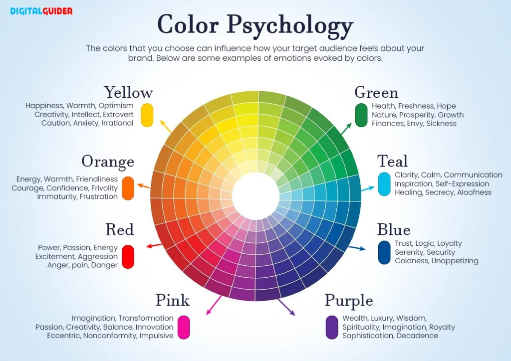
Marketers treat color as a foundational element of visual communication, and not just decoration. Below are key ways color is used strategically:
First impressions and visual judgment
A large share of how people perceive a brand or product comes from color alone. According to HubSpot, up to 90% of an initial impression is due to color .In another context, brands using consistent signature colors can boost recognition by as much as 80 percent.
Visual consistency and brand identity
Once people form an impression, consistent color use helps people remember who you are and recognize you over time. Marketers aim to apply the same palette across logo, packaging, website, ads, and other touchpoints so that color becomes part of the brand’s identity instead of random choice.
Setting the mood without clear claims
Instead of saying that one color always means one thing, marketers pick broad moods. A palette can make a brand feel calm, lively, or high-end, while still letting images and words do their part.
Signaling the product type
Research shows people care most about whether a color feels right for the product or brand. In other words, the best choice is not about the “emotion” of the color alone but whether it suits the category and message.
Standing out in crowded markets
Color helps a brand or product get noticed when surrounded by rivals. If most brands in a field use similar shades, picking a different color or mix can create instant contrast.
Testing and optimization
Marketers often perform A/B tests or user research to compare different color options for call-to-action buttons, banner elements, or packaging accents. This reduces reliance on guesswork and helps find which colors perform best for a particular audience or context.
Cultural and local meaning
Colors can mean different things in different cultures. A shade that works in one place or group may fail in another. Marketers adjust or test colors across markets to avoid mixed signals. For example, Pepsi made a crucial mistake when it expanded to the Southeast Asian market. The company colored its vending machines light blue, which seems fine at first. But what they didn’t realize was that it was culturally associated with death in that region of the world. As a result, their sales took a huge hit.
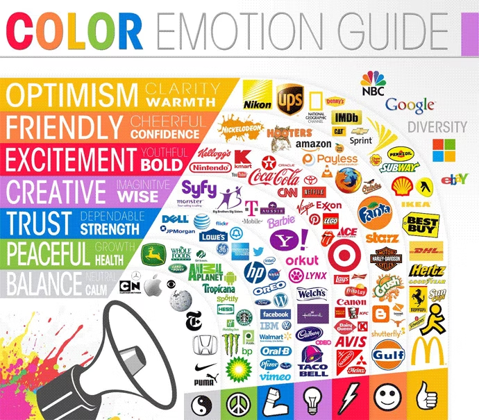
Color breakdowns
Blue
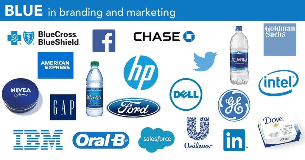
Blue is one of the most widely used colors in branding and marketing, chosen for its strong associations with trust, professionalism, and calmness. People often connect blue with reliability and stability, which makes it a popular choice for industries like finance, healthcare, and technology.
Darker shades of blue convey authority and professionalism, while lighter shades evoke tranquility and peace. Blue is also one of the most universally liked colors, giving it broad global appeal.
Many well-known brands use blue to strengthen their image. IBM, American Express, and Chase use blue to communicate trustworthiness, and social media platforms like Facebook and Twitter rely on blue to boost user engagement. In healthcare, blue suggests cleanliness, safety, and professionalism, which makes WHO using it not surprising. The hope is always to create a sense of confidence in their services. Blue is a prime example of how color psychology in marketing can influence perception and behavior.
When using blue in branding, it is important to select the right shade and combine it thoughtfully with other colors. Lighter blues can create a calming effect, while darker blues emphasize authority. Pairing blue with white or gray enhances its professional feel, and adding warmer accents like orange can create balance and friendliness.
Because blue is so popular and used in almost every industry, you have to be very strategic and smart if you want to make blue the primary color of your brand. Play around with the pallette, the shades and combine them with secondary colors to stand out from the crowd.
Purple
Purple mixes the calm of blue with the energy of red. People often connect it to creativity, luxury, and being unique. Long ago, purple was rare and expensive, so it became a symbol of royalty. For example, in the Roman Empire, high-ranking officials wore purple, which at the time was more expensive than gold. Today, it still feels fancy and special.
Brands use purple to show they are high-quality or creative. It is common in beauty, tech, and entertainment. For example, Hallmark and FedEx use purple to stand out and look premium. Hallmark in particular makes good use of purple, as in modern contexts it’s seen as a more feminine color, and it goes well with their predominantly female audience.
When using purple, pick a shade that fits your brand. Lighter purples feel playful and soft, while darker purples feel elegant and serious. Using purple the same way across your logo, packaging, and website helps people remember your brand.
Why some brands avoid purple?
Purple is less commonly used in branding compared to colors like blue, red, or green. This is because people’s view on purple can differ and may not always align with a brand’s desired image. In some cultures, purple is associated with mourning or spirituality (Catholic dominated countries for example), which might not fit well with certain brand messages. Also, purple can sometimes be perceived as too feminine or whimsical, and this makes it less suitable for brands who have a broader or more male audience.
Orange
Orange is a vibrant color that combines the energy of red with the cheerfulness of yellow. It’s often associated with enthusiasm, and warmth. Brands use orange to appear friendly, energetic, and approachable.
Many companies choose orange to stand out and convey a sense of fun and excitement. For example, brands like Fanta and Nickelodeon use orange to create a lively and welcoming image.
However, orange can also have some negative associations. It’s used in warning signs and safety equipment, which can make it seem aggressive or alarming. Additionally, some people find orange overwhelming or childish, which might not suit all brands.
When using orange, it’s important to consider your brand’s message and audience. Pairing orange with neutral colors can help balance its intensity. Using it sparingly in accents or call-to-action buttons can also be effective.
Interesting fact: In the 1950s, GTE, a telecommunications firm, was one of the first to use orange in branding to show that the company was modern and forward-looking. This early use helped make orange more popular in other industries.
Red
Red is a strong, attention-grabbing color. It’s often used to create excitement and urgency. Brands like Coca-Cola and YouTube use red to make a bold impression and energize their audience.
Red can also increase heart rate and appetite, which is why it’s commonly used in food advertising and restaurant logos, most famously McDonald’s. However, it can have negative associations; for example, in price promotions, red can sometimes make discounts seem less valuable, especially when the discount is small.
Green
Green is a color that symbolizes nature, health, and tranquility and is often associated with growth, renewal, and balance. Brands use green to spread the messages of sustainability, wellness, and environmental consciousness.
Many companies in the food, health, and eco-friendly industries put green into their branding. Whole Foods and Starbucks are prime examples of this. The calming effect of green can also influence consumer behavior. It can make them feel more relaxed and open to positive experiences.
Green is also linked to money, success, and growth, especially in Western countries where U.S. dollars are green. This makes it a good choice for brands that want to show financial trust and stability.
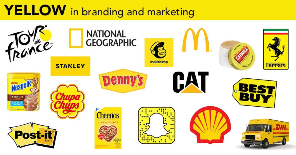
Yellow
When talking about marketing and advertising, yellow is a mixed bag. On the one hand it’s connected to optimism, warmth, happiness and innovation. And this is used to full effect by brands like McDonald’s and Nesquik. On the other hand, it can also signal fear and anxiety, which is why they’re often used on road warning signs.
Yellow is not as often used in marketing as you might think. There are a few popular brands that do it well, and any attempt at emulating them will, rightly or wrongly, draw comparisons. The McDonald’s golden yellow M arch is so iconic, that any restaurant trying to have a single color logo with a single letter will immediately be deemed a lazy and unoriginal. So, it’s important to be aware of the associations that choosing a yellow logo may have for your own brand.
Black
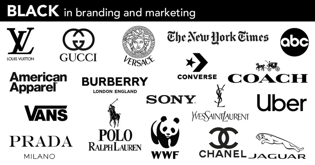
Black is commonly used to signal elegance and power. It feels strong and timeless, which makes it a go-to for many premium and luxury brands.
Brand examples:
- Chanel uses black (often with white) in its logo to showcase luxury and simplicity.
- Apple often features black in product design and logo to suggest minimalism and sophistication.
- Nike uses black to convey power and strength. Their “swoosh” logo and many of their ads use black prominently to boost contrast with white backgrounds.
- Mercedes combines black and silver to project high quality, reliability, and prestige within the car industry.
Black has long been tied to class and formality. Think of tuxedos, black-tie events, and luxury cars. In design, it started as the standard color of ink in printing, so people naturally connected it with seriousness and authority. Over time, brands picked up on this and used black to make their logos and packaging feel sleek and timeless.
Almost a quarter of the biggest global companies use black, white, or grayscale logos. Black is especially common because it is easy to recognize and always looks sharp.
Black works well because:
- It pairs with almost any other color without clashing.
- It looks clean and sharp, especially in high contrast (e.g. black text on white, or the reverse).
- It signals luxury, seriousness, and professionalism. People often see black as high status.
- Black designs are often easier to reproduce across different media: print, digital, clothes, packaging.
White
If your brand wants to project a fresh and simple image, white is a strong option. Much like black, it carries a modern feel and can suggest purity and clarity.
At the same time, too much white can seem cold or sterile, similar to a hospital. If not balanced with other colors, it might come across as empty or dull. Still, when used well, it can create a powerful effect. Brands like Apple and Tesla have used white successfully to highlight innovation and a clean aesthetic.
For Adidas, white plays a similar role to how black works for Nike. While Nike leans into athletic energy, Adidas often partners with musicians, artists, and cultural figures. White gives them a broad, minimalist appeal that feels universal and stylish.
Final word and color cheat sheet
Colors play an important role in how people experience your brand. Each one sets a mood and shapes first impressions. Finally, to make it easier, here’s a quick cheat sheet you can come back to:
| color | strengths | weaknesses | brand example |
|---|---|---|---|
| Black | sleek, powerful, bold | can feel harsh or unapproachable | Nike |
| White | clean, simple, modern | risk of looking sterile or plain | Apple, Adidas |
| Pink | playful, creative, youthful | might be dismissed as too “soft” | Barbie, Cosmopolitan |
| Blue | trustworthy, calming, dependable | overused, can blend in | Facebook, PayPal |
| Red | energetic, urgent, attention-grabbing | can overwhelm or feel aggressive | Coca-Cola |
| Green | fresh, natural, balanced | may limit you to eco-friendly vibes | Starbucks |
| Yellow | optimistic, energetic, attention-grabbing | can feel overpowering or cautionary | IKEA, Sprint |
| Purple | creative, luxurious, imaginative | can feel artificial or excessive | Cadbury, Yahoo |
FAQ
1. What is color psychology in marketing?
Color psychology in marketing studies how colors influence people’s feelings, perceptions, and actions. Brands use it to create the right mood, grab attention, and guide customer behavior.
2. Why is color important for branding?
Colors shape first impressions and can make a brand feel trustworthy, energetic, or luxurious. They help customers recognize your brand and understand what it stands for without words.
3. Which colors are most effective in marketing?
It depends on the brand and audience. Blue builds trust, red creates urgency, green signals growth or health, black shows power, white feels clean, yellow draws attention, pink conveys playfulness, and purple suggests creativity or luxury.
4. Can colors influence buying decisions?
Yes. Studies show that color can be a major factor in how customers judge products, even in the first few seconds. The right color can encourage clicks, engagement, or purchases.
5. Do cultural differences affect color perception?
Yes. While some color associations are common globally, cultural context matters. For example, green can mean luck in some cultures and fertility in others, so it’s important to know your audience.
6. How do I choose the right colors for my brand?
Start with the emotions and messages you want your brand to convey. Then, select colors that reflect those feelings, test combinations for contrast and readability, and consider cultural meanings.
7. Can I use multiple colors in my branding?
Yes, but use them thoughtfully. A main color should carry your brand’s core message, while secondary colors can support, highlight, or balance the main tone.


