Table of Contents
What counts as a rebranding cost?
The most expensive rebrands in history didn’t cost millions simply because a company created a new logo. A logo can cost thousands of dollars, and replacing it across a dozen of hotels, gas stations, bank branches, vehicles, uniforms, websites and product packages can cost hundreds of millions.
This is why the figures found in other online rankings can be confusing. One company reports only the cost of designing its new identity, while another includes a global advertising campaign or renovations across multiple locations. Some widely repeated figures are not actually rebranding costs at all.
For this list, we used figures reported by the companies themselves or by credible sources at the time. The amounts are shown in their original currencies and have not been adjusted for inflation. Since every project covered something different, the rebrands are ordered roughly by their reported budgets.
Most expensive rebrands at a glance
| Brand | Year | Reported cost or budget | What the figure covered | Verdict |
|---|---|---|---|---|
| Holiday Inn | 2007–2010 | $1 billion | Global hotel relaunch and property upgrades | Yes |
| BP | 2000 | About $200 million | Brand launch, advertising and public relations | No, long term |
| Accenture | 2001 | $175 million | Global launch advertising | Yes |
| PwC Consulting / Monday | 2002 | $110 million | Planned global renaming and rollout budget | No |
| British Airways | 1997 | About £60 million | Design and implementation across the airline | No |
| BT | 1991 | About £50 million | Company-wide makeover and rollout | Mixed |
| Posten Norge / Bring | 2008 | NOK 300 million | Development, launch and three-year rollout | Yes |
| Tropicana | 2009 | $35 million | Advertising campaign supporting new packaging | No |
| UPS | 2003 | $20 million | First-year brand revamp and promotion | Yes |
| ANZ | 2009 | A$15 million | Buildings, technology and marketing in 2010 | Mixed |
1. Holiday Inn: $1 billion
By the mid-2000s, Holiday Inn had a recognition problem of an unusual kind. Almost everyone knew the name, but many associated it with an inconsistent and dated hotel experience.
In 2007, parent company InterContinental Hotels Group announced a worldwide relaunch of Holiday Inn and Holiday Inn Express. This was much more than a new green logo. The programme introduced new signage, refreshed rooms and public spaces, upgraded bedding and bathrooms, redesigned arrival areas and established new service standards.
IHG described it as a $1 billion investment across more than 3,200 hotels and 430,000 rooms. Most of that money went into improving physical properties, with hotel owners carrying much of the investment. Signage alone reportedly accounted for around $140 million.
Did it work?
Yes. The rebrand was supported by a noticeably better product, which is one reason it delivered measurable results. During the rollout, IHG reported that relaunched hotels were outperforming control properties by 3% to 7% in revenue per available room
while guest satisfaction scores were also improving. In a 2009 update, the company put average outperformance at more than 5%.
Holiday Inn shows what a rebrand can achieve when the customer experience changes with the visual identity. The new sign made a promise that renovated hotels could actually support.
Verdict: Yes.
2. BP: about $200 million
BP introduced its green-and-yellow Helios symbol in 2000 and began presenting its initials as “Beyond Petroleum.” The aim was to move the company away from the image of a traditional oil producer and towards a broader, more environmentally responsible energy business.
The exact cost depends on what is counted. At launch, The Guardian reported that the brand change itself had cost $7 million and that BP planned to spend another $100 million a year developing it. The wider public relations and advertising effort is commonly reported at about $200 million.
Initially, the campaign changed perceptions. Research later found that consumers exposed to the advertising were more likely to see BP as environmentally responsible. By 2008, one survey found that BP was perceived as greener than its oil-industry competitors.
Did it work?
Only in the short term. The messaging created a greener image, but the company’s operations struggled to support it. After the 2010 Deepwater Horizon disaster, BP dropped out of Interbrand’s top 100 global brands for the first time in 11 years. A later academic study found that BP’s reputation fell by more than 50 points relative to a comparable control after the spill and had still not fully recovered by the end of 2017.
The campaign may have influenced public perception, but it also increased the gap between what BP said and what people believed its business actually represented. “Beyond Petroleum” eventually became one of the most frequently cited examples of greenwashing.
Verdict: No, not in the long term.
3. Andersen Consulting to Accenture: $175 million
Andersen Consulting was required to adopt a new name after separating from Arthur Andersen. The company chose “Accenture,” derived from “accent on the future,” following an internal naming process involving employees around the world.
The most often-cited cost of the 2001 rebrand is $100 million. However, a contemporary account of the launch describes a $175 million global advertising campaign designed to transfer the equity of the Andersen Consulting name to Accenture and remove references to the former brand.
The timing created a big risk. A global professional services company was giving up a recognised name and replacing it with an invented one. Also, it created an unexpected advantage. Arthur Andersen became associated with the Enron scandal soon afterwards, while Accenture already established a separate identity.
Did it work?
The unfamiliar name quickly became a major global consulting and technology brand. Accenture completed an initial public offering in July 2001, reported more than $11.4 billion in revenue for that financial year and continued expanding under the new identity. By fiscal 2025, annual revenue had reached $69.7 billion.
That growth cannot be credited to a name alone. The more useful measure is that the new identity successfully carried the company through a forced separation, built recognition and remained in place for more than 25 years.
Verdict: Yes.
4. PwC Consulting to Monday: $110 million
In June 2002, PwC Consulting announced that it would become “Monday” as it prepared to separate from PricewaterhouseCoopers and pursue an initial public offering.
The name was meant to suggest fresh starts and positive change. Many people instead connected it with the least popular day of the working week. The announcement attracted immediate ridicule, which was an early warning for a company selling strategic advice to other businesses.
The reported $110 million budget covered advertising, corporate materials and the international rollout. Importantly, this was an allocated budget, not a confirmed final amount spent.
Did it work?
IBM agreed to acquire PwC Consulting for approximately $3.5 billion less than two months after the name was announced. IBM confirmed that the business would operate under the IBM brand, so Monday disappeared before the planned rollout was completed.
The sale may have made strategic sense, but it made the rebranding work largely redundant. “Monday” is now remembered less as a business identity and more as a warning against naming that needs a long explanation before it starts to sound appealing.
Verdict: No.
5. British Airways: about £60 million
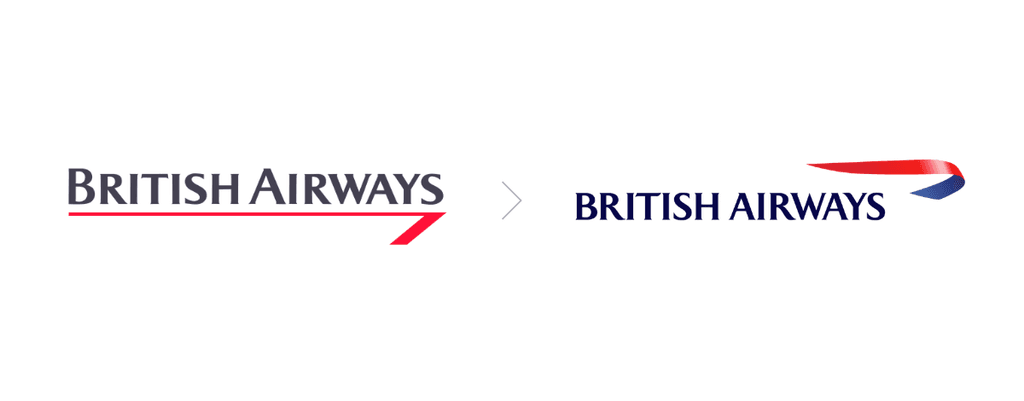
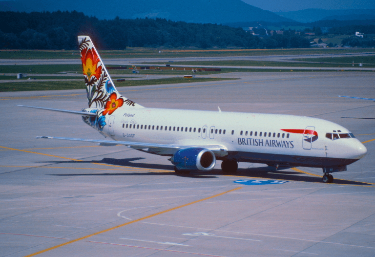
British Airways wanted to present itself as a global airline based in Britain, rather than a carrier defined primarily by British tradition. Its 1997 identity introduced a new Speedmarque symbol, new typography and a collection of colourful tailfin designs inspired by art from different cultures.
The “World Images” programme reportedly cost around £2 million to design and approximately £60 million to implement. . Aircraft, airport spaces, uniforms, printed materials and other customer touchpoints all had to be updated.
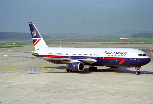
The concept was ambitious, but the varied tailfins weakened one of the clearest visual signals in aviation. Former prime minister Margaret Thatcher famously covered one of the designs with a handkerchief at a public event. Virgin Atlantic responded by placing the Union flag on its aircraft and positioning itself as Britain’s national flag carrier.
Did it work?
In 1999, British Airways stopped expanding the World Images collection after only part of its fleet had been repainted. The airline later standardised its aircraft around the Chatham Dockyard Union flag design.
Some elements of the wider identity survived, including the Speedmarque. The central idea of giving aircraft many different tail designs did not. Instead of making the airline feel more international, it made the fleet less visually consistent and weakened an association that customers already valued.
Verdict: No.
6. British Telecom to BT: about £50 million
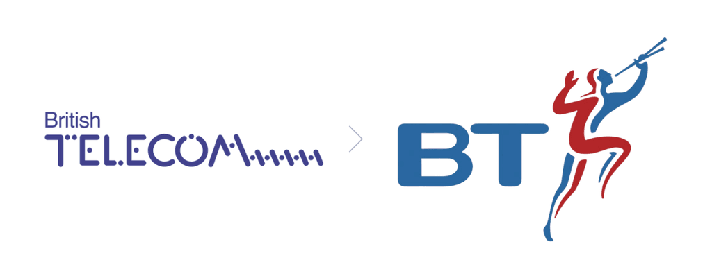
British Telecom shortened its trading name to BT in 1991 and introduced the “Piper,” a red-and-blue figure designed by Wolff Olins. The change aimed to humanise the former state-owned telecommunications company and support its move into a more competitive, international market.
The company-wide makeover was reported to have cost about £50 million. That figure covered far more than the symbol itself, since the identity had to be applied to buildings, vehicles, telephone boxes, uniforms, advertising and a large range of printed materials.
Did it work?
Only partly. The most important element, the shorter BT name, proved durable and remains in use. The Piper also became highly recognizable during its 12-year life.
However, by 2003 the company believed that the symbol had become too closely associated with fixed-line telephones. BT replaced it with a multicolored globe in a new rebrand costing less than £5 million. At the time, a BT executive said the Piper had done an excellent job, while acknowledging that it carried outdated perceptions of the business.
The name change worked better than the visual metaphor attached to it. That makes this a successful simplification paired with an identity that eventually became too narrow for the company it represented.
Verdict: Mixed.
7. Posten Norge and Bring: $53.4 million
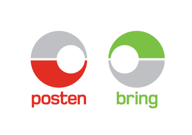
Norway’s national postal operator modernised the Posten identity and launched Bring in 2008. Posten would continue serving consumers in Norway, while Bring brought several logistics businesses together under one brand for corporate customers across the Nordic region.
The company put the total cost at NOK 300 million. Half was allocated to development and launch, while the remainder covered the replacement of branding on vehicles and materials over three years. Much of the rollout was planned around normal operational replacement cycles.
Did it work?
Yes, based on the longevity and strategic use of the two-brand system. Posten and Bring are both still active. The company later adopted Posten Bring as its corporate name, and logistics now represents most of the group’s revenue. In 2024, the logistics segment generated more than NOK 20 billion of the group’s roughly NOK 25 billion in revenue.
It would be difficult to isolate the financial effect of the identity from acquisitions, ecommerce growth and wider changes in the postal market. Still, Bring succeeded in giving the expanding logistics operation a distinct, scalable name outside Norway, which was the main purpose of the rebrand.
Verdict: Yes.
8. Tropicana: $35 million
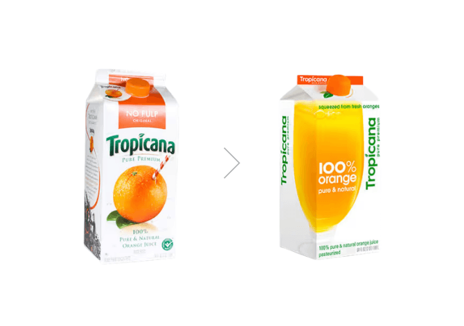
Tropicana replaced its familiar orange-with-a-straw image in 2009 with a cleaner package featuring a glass of juice. The logo was turned vertically, varieties became harder to distinguish at a glance and the most distinctive visual element on the carton disappeared.
The frequently quoted $35 million figure was the advertising campaign supporting the change, rather than a fee paid simply to redesign the packaging.
The new carton reached shelves in January. Customers complained almost immediately, and the commercial impact followed quickly.
Did it work?
Sales of the Pure Premium line fell by about 20% over two months compared with the same period a year earlier, representing roughly $30 million in lost sales. Tropicana announced the return of the original packaging in February, and the familiar orange-and-straw design was back on shelves soon afterwards.
The redesign removed assets that helped people recognise the product quickly in a crowded refrigerator. It may have looked cleaner in isolation, but packaging has to work at the point of purchase, surrounded by competitors.
Verdict: No.
9. UPS: $20 million
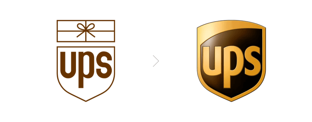
UPS introduced its first new logo in more than 40 years in 2003. FutureBrand retained the familiar shield and brown colour, but removed the tied parcel that had sat above the company name since Paul Rand’s 1961 design.
Removing the package was a strategic decision. UPS wanted customers to see it as a broader logistics and supply-chain company, not only a parcel delivery service. The changes were expected to cost $20 million in the first year, with much of the physical rollout taking place gradually as trucks and other assets were replaced.
Did it work?
The redesign modernised the identity while preserving its most recognisable elements. It also gave UPS room to communicate a broader range of services without abandoning the shield, the name or the brown colour it already owned in customers’ minds.
UPS simplified the logo again in 2014 by removing the glossy, three-dimensional effects, but kept the basic 2003 structure. The rebrand did not have to teach customers an entirely new visual language, which helped it age more effectively than many other early-2000s identities.
Verdict: Yes.
10. ANZ: A$15 million
ANZ launched a new global identity in 2009 as part of its ambition to become a “super regional” bank across Australia, New Zealand and Asia Pacific.
The simplified wordmark was paired with a new symbol that can be read as both a person and a three-petalled lotus. The three sections represented ANZ’s core regions, while the central human form represented its customers and employees. According to the bank, the identity followed 18 months of research with more than 1,300 customers and 250 employees.
ANZ estimated an additional cost of A$15 million in 2010 for changes to buildings, technology and marketing. The rollout took place over 12 to 24 months.
Did it work?
The visual identity did. It remains in use more than 15 years later and gave the bank a consistent symbol that worked in markets using different writing systems.
The wider strategy produced mixed results. ANZ expanded its Asian customer base and corporate banking presence during the following years, but later reduced its regional ambitions. In 2016, the bank sold Asian retail and wealth operations and acknowledged that returns had been lower than expected.
The identity proved more durable than the strategy it was originally designed to express.
Verdict: Mixed.
What about the $1.28 billion Symantec logo?
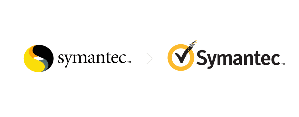
Symantec is regularly placed at the top of “most expensive logo” rankings with a cost of $1.28 billion. That description is misleading.
In 2010, Symantec paid $1.28 billion for VeriSign’s authentication services business. The deal included SSL certificate services, identity protection products, a majority stake in VeriSign Japan, employees, customer relationships and intellectual property. VeriSign’s checkmark trademark was one of the assets and not the sole object of the purchase.
Calling it a $1.28 billion logo is similar to buying an entire hotel and saying the full price was paid for the sign above the entrance.
Pepsi’s 2008 logo provides the opposite problem. Its reported $1 million design fee was genuinely expensive, and the accompanying design document became famous online. However, it is much smaller than the documented global programmes on this list. Pepsi replaced that identity in 2023 with a design that restored more of the brand’s visual heritage.
Why do major rebrands cost so much?
The visual design is usually a small part of the total. Large organisations need research, naming, trademark searches, strategy, customer testing, internal training and new brand guidelines before anything reaches the public. They then have to update every place where the old identity appears. Our article on why logos have become so simple looks more closely at the design pressures behind many modern brand identities.
For a global company, that can mean thousands of signs and vehicles, millions of packages, dozens of digital platforms and advertising in multiple markets. Holiday Inn’s programme was expensive because it changed hotel properties. British Airways had to repaint aircraft. Posten Norge had to update a national delivery network.
The strongest examples also show that spending more does not make a rebrand safer. Accenture spent heavily and created an identity that supported a necessary business separation. Tropicana removed a familiar image and lost sales almost immediately. BP successfully changed perception for a time, but the promise could not survive a conflict with the company’s actions.
So, do expensive rebrands work?
4 of the 10 rebrands in this list achieved most of what they set out to do, 2 produced mixed results and 4 failed or were quickly abandoned. The difference was rarely the visual quality of the logo alone.
Successful rebrands tended to preserve useful recognition, solve a real business problem and arrive with changes customers could experience. Unsuccessful ones weakened distinctive assets, created a promise the business could not support or became irrelevant before the rollout was complete.
A rebrand can change how a company is recognised. For it to change what people believe, the rest of the business has to move with it.
If your brand has outgrown its current identity, Deborah can help you define what should change, what is worth keeping and how to build a visual system that works across every customer touchpoint. Contact us to discuss your rebrand.
FAQ
1. What is the most expensive rebrand in history?
Holiday Inn carried out one of the most expensive rebrands in history, with a reported investment of $1 billion between 2007 and 2010.
2. How much does a major rebrand cost?
A major corporate rebrand can cost anywhere from thousands to hundreds of millions of dollars. The total depends on the size of the company and whether the budget includes research, design, advertising, packaging, signage, vehicles, uniforms and physical renovations.
3. Why are corporate rebrands so expensive?
Designing a new logo is usually only a small part of the total rebranding cost. Large companies must introduce the identity across every physical and digital customer touchpoint, often in several countries and languages.
4. What are some examples of failed rebrands?
Tropicana, British Airways, BP and PwC Consulting’s proposed “Monday” identity are among the best-known failed rebrands. Their problems included removing familiar brand elements, creating an identity customers disliked and making promises the business could not support.
5. How can a company measure whether a rebrand worked?
A company can compare brand recognition, customer sentiment, website performance, sales and other relevant metrics before and after the change. A successful rebrand should also solve the original business problem without weakening the recognition and trust the brand has already built.