Table of Contents
The great flattening of brand Identity
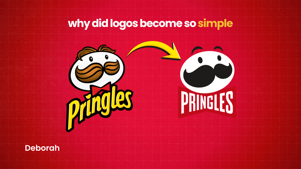
Right now, graphic design is in a phase where many brands look very similar, which naturally raises the question of why did logos become so simple. Instead of detailed logos with symbols, most companies are switching to simple word-marks. Their name alone, usually in clean, geometric sans-serif fonts.
From a designer’s view, this makes sense. The old rule was to craft a unique logo with a symbol so the brand would stand out. But today, that’s much harder. Most simple shapes and ideas are already taken, even something as basic as an apple.
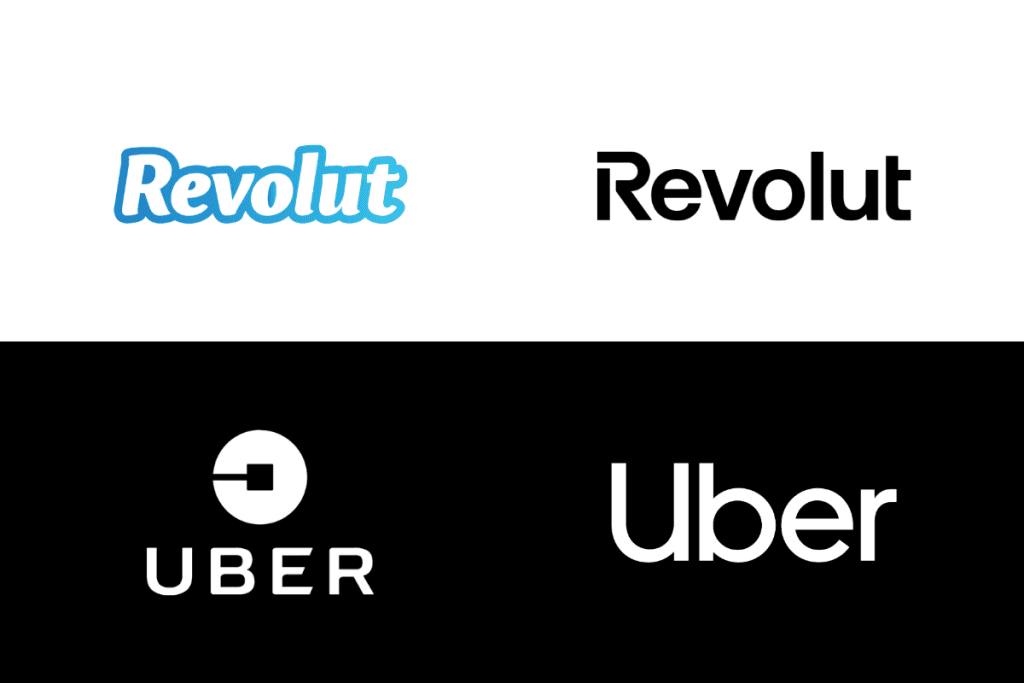
That’s why many brands now embrace simplicity. A straightforward wordmark, like Uber or the redesigned Revolut, is often enough to create a strong, recognizable identity without needing a separate symbol.
Why minimalism is popular in branding
Logos were created with full detail and served as the main focus of the brand’s communication. Today, things are trickier. Many designs include multiple logos: sponsors, partners, organizers. All in one space. The real challenge isn’t placing the main logo, but making several logos work together without ruining the overall look.
Modern technology is reshaping how people engage with brands. Online, brands must grab attention fast, make the most of small screens, and adapt to shrinking attention spans.
The average person sees 6,000 to 10,000 ads a day across devices, so standing out is tough. This has pushed brand design toward simplicity, adaptability, and instant recognition, often at the expense of bold, original visuals.
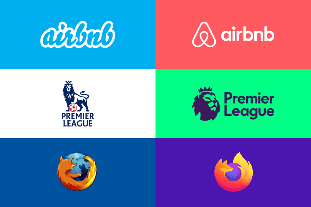
Brands that work equally well on a phone, billboard, or TV ad are more successful than those that can’t scale. That’s why Warner Bros, the English Premier League, and Burger King have all simplified their branding recently, removing much of their original flair for versatility.
Today, immediacy and efficiency matter more than uniqueness, rewarding designs that are clear, adaptable, and instantly recognizable.
Being unique isn’t a good thing
So what’s the point? When designers line up multiple logos, they aim for a balanced, even layout. The more varied the logos are, the harder it is to make them look visually aligned. There’s no tool that can automate this, designers have to rely on their own eyes and judgment. That’s why so many logos today are simple sans-serif wordmarks – black, minimal, and easy to align. They work well together, almost like a system.
Looking closer, it seems brands still haven’t agreed on basic details like whether to capitalize the first letter. Some logotypes even include a dot at the end. What does it really add to these otherwise uniform, characterless logos? Similarly, small tweaks to a main letter, like those seen in Casper or Fluidly, raise the question: do they truly make the logo unique while still blending in with the broader trend?

It’s also getting harder to create truly original visual elements. Almost all simple, recognizable shapes are already taken: Apple owns the apple, Twitter has the bird, and even more specific shapes, like a dove… owned by Dove and so on.
To work around this, designers have turned to dynamic identities. Instead of relying on a logo as the single centerpiece, it becomes part of a broader visual system. By combining the logotype with type, color palettes, and predefined graphic rules, brands can create a variety of visuals that are unique and recognizable even if the logo itself is simple.
The bigger challenge is time. Many iconic logos with symbols are memorable because there’s an “a-ha” story behind them: heritage, meaning, or clever storytelling. Finding that insight can take seconds or much longer and it’s often what separates a forgettable logo from a timeless one.
It’s not all bad
There’s still room for creativity. While big international brands are simplifying their identities, some daring companies are using bold design to stand out.
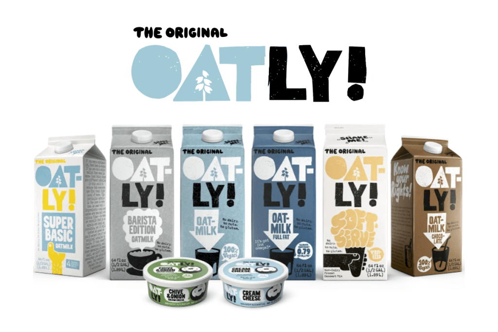
Startups and younger brands aren’t held back by politics or processes, so they can experiment, take risks, and grab attention in ways established companies often can’t. Oatly is a perfect example – their colorful, playful branding helped drive an 88% sales jump in 2020, even during the COVID-19 pandemic.
It’s not just small companies, either. Global brands like Marmite, Virgin, and Channel 4 have made bold, original advertising a key part of their identity.
So while the trend leans heavily toward minimalism and simplicity, there’s still space for creativity and originality, especially for brands willing to take risks.
The “Golden Ration”
Forbes reports that consistent branding across platforms can boost revenue by up to 23%. Today, successful brands need to be versatile and instantly recognizable, so designers focus on logos that work across all mediums and sizes.
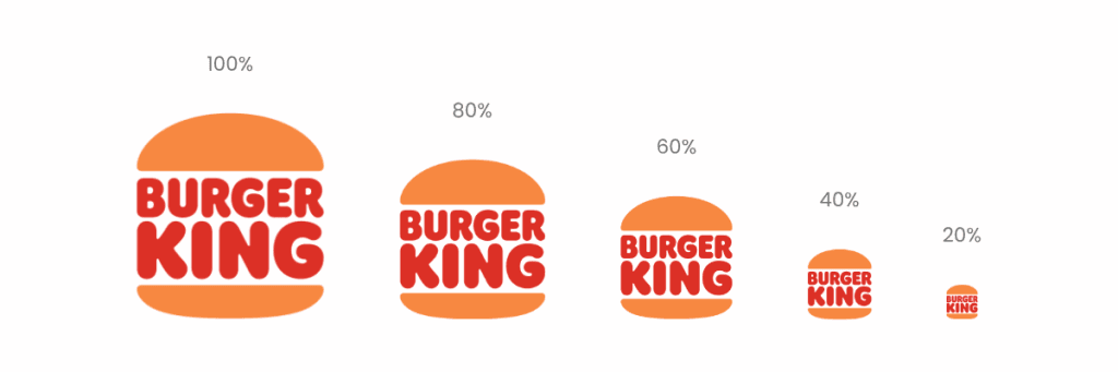
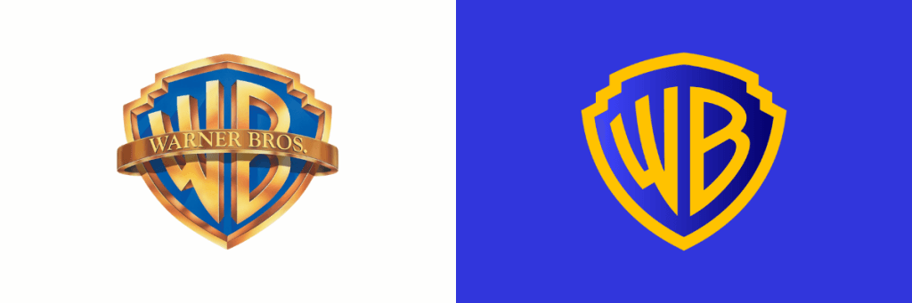
Take the new Warner Bros. logo: it simplifies the classic shield using the Golden Ratio, a mathematical principle known for creating perfect balance and harmony. This approach keeps the logo clean, adaptable, and instantly recognizable, even if it loses some of the original’s unique charm. As Pentagram, the studio behind the redesign, explains: the logo is optimized to perform everywhere, from tiny digital spaces to the iconic Warner Bros. water tower.
In the end, business needs often outweigh creativity. The logo may feel less exciting, but it works everywhere.
Psychology behind all of this
Big Tech cracked a surprisingly simple code: our brains crave simplicity. Our minds can process visuals a whopping 60,000 times faster than text. The simpler the image, the faster it lands in our heads. This speed boost doesn’t just make things easier to recognize; it also sticks longer in memory and hits harder emotionally.
This is why logos have turned into a high-stakes game. They’re the very first handshake your brand has with the world, and companies are racing to streamline them – not just to look sleek, but to tap directly into how our brains naturally work.
Take a stroll down memory lane with Google’s logo:
- 1999: Busy, shadow-heavy design
- 2010: Glossy, almost 3D look
- 2015: Clean, flat sans-serif
With each iteration, Google stripped away complexity, making their logo instantly recognizable. And it pays off. Research shows that 42% of consumers are more likely to trust brands that have updated, modern logos. A little simplicity can go a surprisingly long way.
Digital revolution
Simplicity in logos isn’t just a style choice. It’s a survival tactic in the digital age. Today, a logo has to shine everywhere: from tiny app icons and social media avatars to website headers and even smartwatches.
Old, complicated designs quickly hit their limits:
- Gradients blur into mush at small sizes
- Shadows and 3D effects lose their impact
- Fine, delicate text becomes unreadable
Clean logo design benefits
Enter Airbnb in 2014. The company made a bold move, swapping its casual script logo for the now-famous “Bélo” symbol – a sleek, continuous line forming a distinctive shape. The internet had a field day, some comparing it to everything from abstract art to… well, human anatomy.
But Airbnb had the last laugh. Their previous logo simply couldn’t keep up in a digital-first world:
- Animations were a headache
- Tiny icons turned it into a jumble of letters
- It lacked visual consistency across platforms
The new logo solved all of these problems in one clean stroke, proving that simplicity isn’t just about looking good, it’s about working smarter. In today’s digital landscape, functional design often trumps fancy design.
Here’s the really fascinating part: our brains are hardwired to love simplicity. We naturally gravitate toward:
- Straight lines over winding curves
- Circles over complex polygons
- Basic patterns over intricate, busy designs
Research shows that simple shapes and colors influence 75% of consumer perceptions. It’s no wonder brands are embracing minimalism with such gusto.
By streamlining their logos, companies aren’t just following a trend, they’re making them:
- Instantly recognizable
- Memorable in a crowded marketplace
- Functional across every screen and size
- Lightning-fast to load on digital platforms
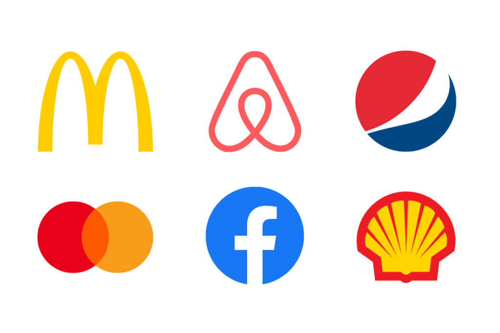
But there’s a twist. The relentless drive for simplicity has led to an unexpected side effect: logos are starting to look very similar.
It’s not about laziness or lack of creativity, it’s evolution. Much like animals in similar habitats develop comparable survival traits, logos are adapting to thrive in the digital ecosystem.
And this trend isn’t slowing down. Each year, more brands pare down their designs to keep up with shrinking attention spans and the demands of an always-on, information-overloaded world. In today’s digital landscape, simplicity isn’t just stylish, it’s survival.
Lesson is clear. Attention is currency, simplicity wins. It’s not just logos, your messages need it too. The most successful brands aren’t everywhere; they’re smart, clean, and memorable.
The rewards? More customers, more investors, top talent, all without overcomplicating things. Simplicity isn’t just elegant – it’s effective.
Conclusion
We live in a fast-moving, data-driven world where every decision is about money and speed. Companies aren’t willing to wait for a “perfectly unique” logo or pay extra for it. Even the most original design can fail if it doesn’t fit neatly alongside other logos in a lineup. Collaboration is the rule now, and logos have to follow.
Marketing has changed too. Brands can succeed without visual uniqueness because we’re buying emotion and lifestyle more than function. Ironically, this means design is everywhere but also looks almost identical. These paradoxical strategies make design feel important and irrelevant at the same time.
Design’s real value today is adaptability. Logos need to scale, fit any context, and respond instantly to trends. The easiest way to do that is simplicity, which often means uniformity and fewer bold, complex ideas. There’s no longer a “timeless” goal in advertising, everything reacts to the moment. And that’s why so many logos are just clean, sans-serif wordmarks: simple, scalable, and ready for anything.
FAQ
1. Why are logos so simple now?
They need to work everywhere, tiny screens, websites, apps – so simplicity ensures clarity and scalability.
2. Do simple logos look boring?
Not really. Simplicity improves recognition, functionality, and emotional impact.
3. Why not make logos completely unique?
Most simple, recognizable shapes are already taken, making originality tricky.
4. How does digital affect logo design?
Logos must load fast, scale small, and grab attention instantly. Complex details often fail digitally.
5. Can minimal logos still be creative?
Yes, brands like Oatly and Virgin use bold colors and playful designs within minimal frameworks.
6. Why are wordmarks popular?
Clean text logos are easy to align, scale, and instantly recognize, like Uber or Revolut.
7. How does psychology influence logos?
Brains process straight lines, circles, and simple patterns faster; 75% of consumer perception is shaped by simplicity.
8. Do simple logos boost business?
Yes, modernized logos increase trust, recognition, and can improve revenue.
9. What’s a dynamic identity?
It’s a system where a simple logo combines with colors, type, and rules for flexibility and variety.
10. Is minimalism here to stay?
Yes, attention spans and digital demands favor simple, adaptable designs, though creativity still finds room.